Why Landing Pages Are Important
A landing page is a dedicated page that has been solely designed to convince users to sign up to a service or product. Landing pages are generally quite minimalistic in design since they are optimised to get users to do one thing, and one thing only, without the many distractions of a typical webpage.
It’s easy to see why landing pages are important then: they serve to boost your conversion rate.
Not only that, but landing pages tend to have conversion rates that are even higher than the conversion rate of regular webpages. In fact, depending on your industry, a conversion rate of 10% for a landing page is not unheard of. However, more on this later.
And this is why it’s absolutely important to provide the best landing page for Google Ads possible in order to drive as many conversions as possible.
Best Landing Page Examples
Imitation is the sincerest form of flattery, so the saying goes, but it’s also the best way to beat the competition at their own game or to gain insights from major players that are already employing successful tactics.
As they say: if you want to be the best, you must learn from the best. And, in no particular order, these are the best landing page designs that we have come across. ????????
1. Vivobarefoot
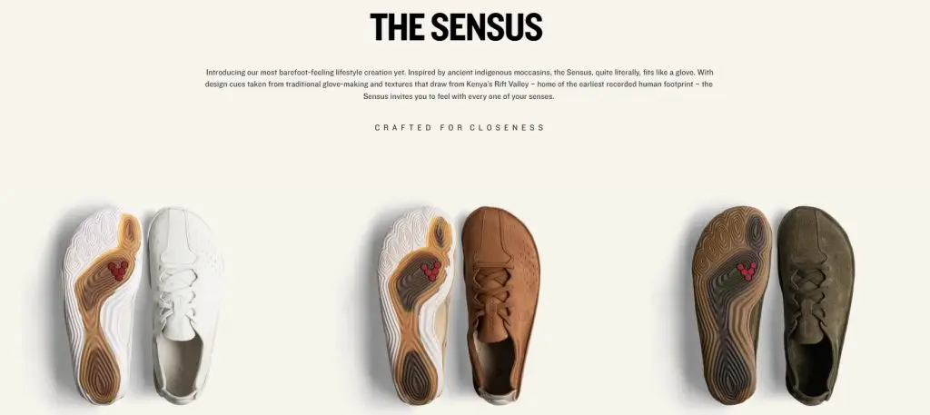
The first entry on our list is dedicated to Vivobarefoot, a barefoot shoe brand. For those not in the know, barefoot shoes are shoes that are specially designed to mimic the feeling of walking or running barefoot.
However, those who know anything about barefoot shoes will know that Vivobarefoot is one of the premium brands in the industry—so it comes as no surprise that they have created an amazing landing page to announce the launch of their newest shoe model: The Sensus.
Vivobarefoot’s dedication to minimalist footwear, natural movement, traditionalist beliefs, and transparency regarding their products really comes out in this landing page. For instance, he’s how they explain the manufacture of their newest model:

Showing the constituent parts of their shoe without all of the stitching is a great example of their dedication to inform their clients of the way their shoes are made.
Same goes for their strong beliefs regarding living in more natural ways by being closer to nature and our natural history, as you can see here:

However, these are only a few parts of this fantastic landing page: we didn’t even touch on the beautiful cinematic that greets you when you arrive to this landing page. The cinematic represents two dancers, each wearing The Sensus, dancing together in a room full of dangling silks. It’s definitely a beautiful sight to behold!
2. Canva
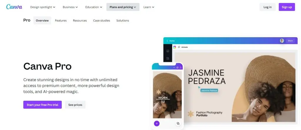
To continue our list, we are looking at Canva’s landing page, which is a simple but attractive design. This landing page example is a largely white page with pops of vibrants colors.
Thanks to the straightforward design, the text becomes more promiment, which of course helps with readability. The page also ends with an FAQ section, indicating a proactive approach to addressing potential customer queries.
Finally, Canva places the product they are trying to sell front-and-center, which serves to engage visitors effectively as it leaves no doubts to the landing page’s purpose.
3. Get Response
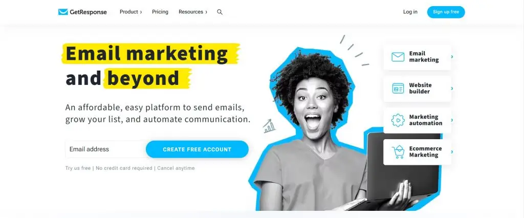
Up next, we have the Get Response landing page which ticks all the right boxes, which include impactful elements such as a strong headline; captivating images; a list of their clients as well as a list of their features.
Not only do they capture visitor’s attentions through their images, but they also highlight important words, directing readers’ attention to the words that matter most.
The final insight is also quite powerful: despite the length of Get Response’s page, the page still manages to effectively encourage visitors to register through numerous strategically placed CTAs.
Never underestimate the subtle power of CTAs placed in all of the right places!
4. Great Jones
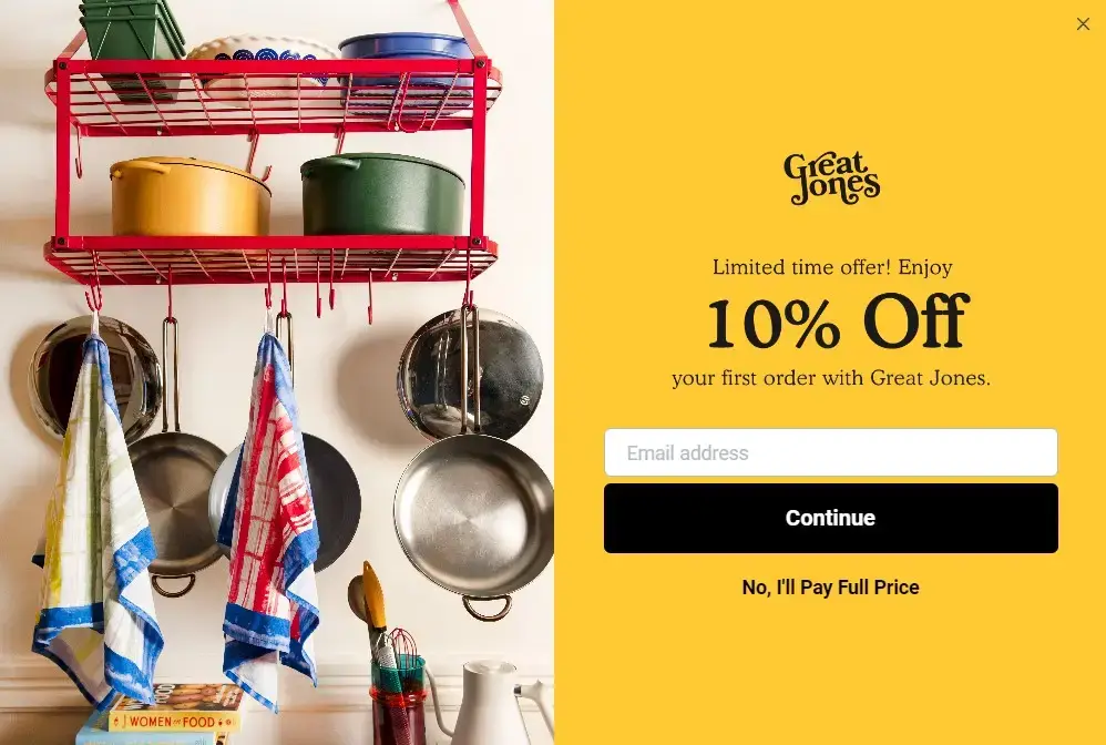
Great Jones is a company that specializes in bright, simple, and subtle cookware and its landing page captures all of these features.
With the strong and gorgeous colours of its products juxtaposed with a fairly large CTA that’s set against a bold and vibrant yellow, it’s hard not to capture a visitor’s attention—especially when there’s 10% discount promised.
However, one possible improvement on Great Jones’ landing page is to provide a description of the items pictured, which would allow users to easily identify and locate specific items when they eventually decide to make a purchase.
5. Muzzle
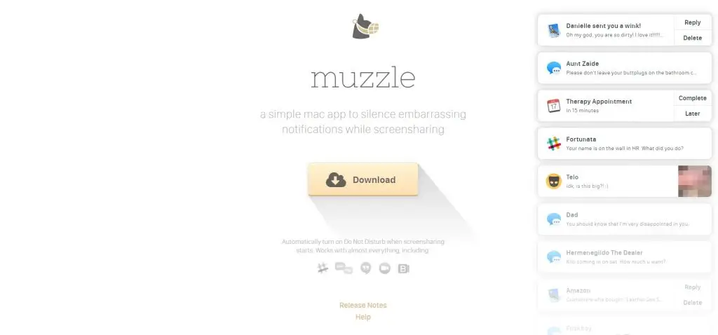
This next landing page take a sharp turn from the traditional landing pages practices that we’re used to: rather than inundate a visitor with text, the website simply shows users the benefits of its product.
Muzzle is an app that silences on-screen notifications and its landing page exhibits the problem the app intends to solve by humorously displaying a barrage of intrusive notifications on the screen.
While the false notifications are indeed funny, and the page has an attractive design, the contrast of light gray text on a white background is not strong enough and could cause readability issues.
6. Intercom
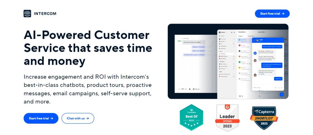
While Intercom’s landing page is attractively designed, taking a page out of Canva’s book with a largely white design, the strengths of the landing page lie beyond its design.
Riding the current wave of fascination with AI, Intercom puts its relevant AI-powered features at the top of the page, displaying the necessity for adaptability in today’s fast-changing world.
Not only that but Intercom establishes trust in a big way by not only displaying its awards and badges of trust, but they also back up every claim they make with undeniable facts.
7. Mailchimp
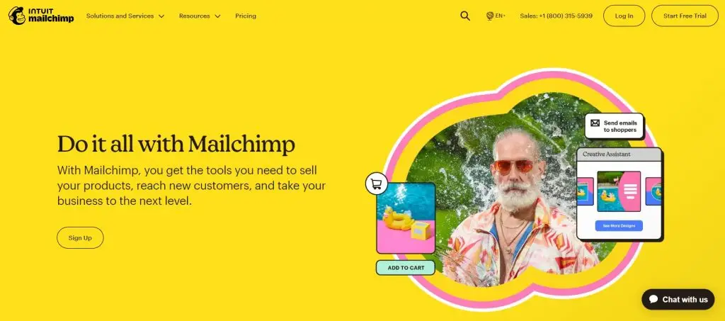
Mailchimp’s landing page design is a lesson in standing out thanks to the psychology of color. Its attention-grabbing yellow background is a bold color choice which serves to reinforce brand uniqueness.
The choice of color serves to remind brands that sometimes it’s ok to break the mold and go with an unconventional choice. However, Mailchimp’s landing page serves as a double whammy as a lesson in best landing page layouts.
Not only does the choice of color prove effective, but Mailchimp has made sure to constantly remind users the point of their landing page: signing up to their service.
In fact, Mailchimp’s landing page has 3 CTAs scattered strategically throughout. If that doesn’t grab a reader’s attention, we don’t know what will!
8. Talkspace
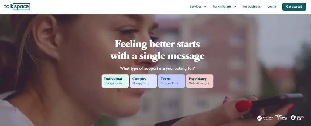
The Talkspace landing page drives straight into establishing trust from their users by highlighting the confidentiality and security of their service, while also guaranteeing the professionality of their therapist, which is vital for users considering online therapy.
Not only does Talkspace explain its services but also provides additional mental health resources, enriching user experience in the process.
And even the use of shapes on the landing page enhances visual engagement, creating an overall layout that is clean, inviting, and informative.
9. NP Digital
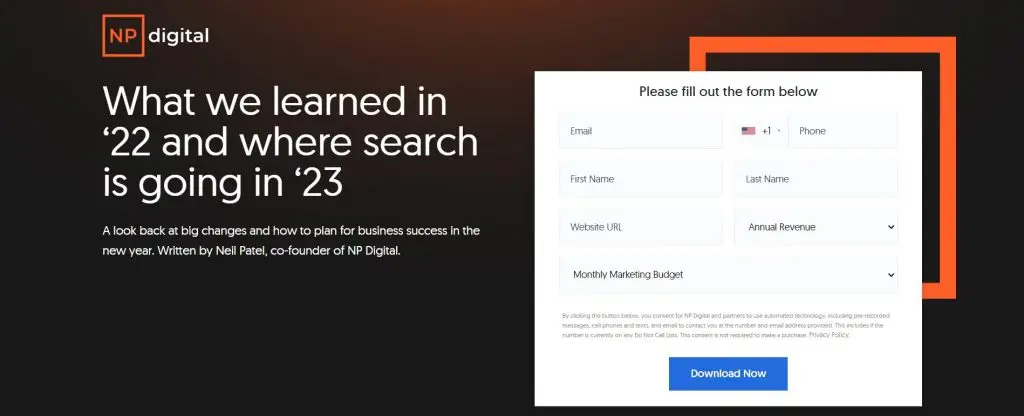
NP Digital’s landing page deviates from traditional product-focused goals to instead prompt users to download a market research report conducted by their team.
The landing page is short on purpose, even going so far as to remove things like social proof in order to provide a streamlined experience on the landing page. In fact, the goal of the page is simply to provide a snapshot of the report’s content and facilitate downloading.
This goes to show that a landing page ought to only be as long as necessary in order to provide the essential details needed to get users to convert.
10. Airbnb

Airbnb’s landing page attracts potential hosts in the most effective way possible: showing them how much money they could be making from their property.
Right off the bat, users are engaged thanks to the enticing “offer” placed front and center as soon as the landing page is opened. Not only that, but the landing page has been tailored to the user, meaning that each user will have a different experience of the page.
Depending on their location, size of their property, and the average prices in their vicinity, users can get an estimated guess of their earnings. Moreover, a slider lets them get a larger range of predictions by adjusting how many nights the property can be rented out for.
11. Landbot
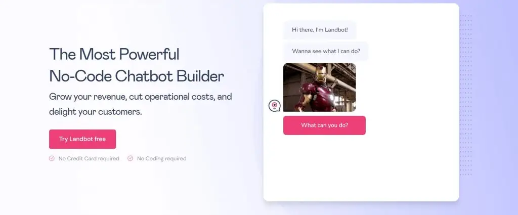
Landbot’s landing page places their services front and center by having a simple, interactive, and friendly chatbot at the top of their page.
This provides a fun experience while also understanding the product that they are offering. Moreover, if you interact enough with the chatbot, it starts asking for your information, which is a fun detour from the conventional registration forms.
If you offer a product that can be converted into a fun, free trial, do yourself a favour and put it at the top of your landing page so that users can easily interact with it.
12. Zillow
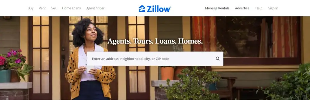
Zillow’s landing page goes with a straightforward approach to gather user information: a simple form requesting the user’s home address. The user is then directed to a map with a number of properties, their prices, and characteristics on display.
The sheer amount of data provided establishes Zillow’s authority as a real-estate marketplace, and while vast, the clear and crisp layout of their pages never makes the data feel overwhelming.
Once users have entered their address, they can estimate the value of homes in their vicinity, a bit like a game, which can help to boost engagement. However, if a user wants a more accurate estimate, Zillow prompts users to sign up for more comprehensive data, such as comparable homes and mortgage tools, by providing their email.
13. Mooala
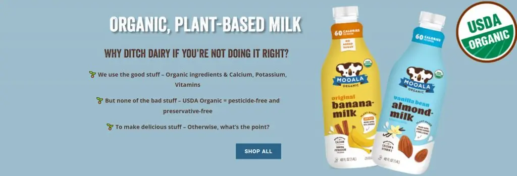
Mooala, an alternative milk company, goes all out on colors and playful language in its landing page.
By making use of vibrant colors that surprisingly blend well together and also selling your product using playful language like “Why ditch dairy if you’re not doing it right?” Mooala also creates a brand identity whilst at the same time having a compelling landing page.
However, other than colorfulness, Mooala’s page provides a host of other bits of information like recipes; product details; and the benefits of organic milk.
14. Bills.com
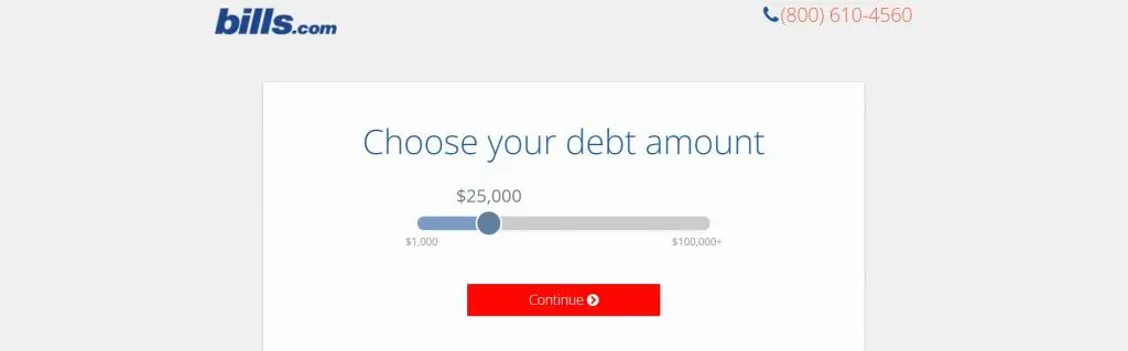
Bills.com’s landing page is surprisingly simple but super effective thanks to one thing: personalization.
By providing a slider than users can adjust as they please, as well as a brief round of questions before being taken to a form, users can feel like the experience is tailored to them personally, which can increase the likelihood of conversions.
The one thing that this landing page does wrong is the drab colours: it may be a landing page about paying off your debt, but that doesn’t mean you have to make the experience dreary by using a dull grey background.
15. HubSpot
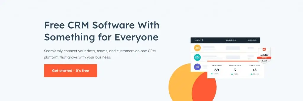
HubSpot’s landing page effectively addresses one of the biggest concerns for small businesses: costs. And that’s no different when it comes to buying CRM software.
That’s why HubSpot’s landing page is so effective: it highlights its free offering and also explains that just because it’s free doesn’t mean that it’s restricted to only a couple of features. This easily entices potential users, as you can imagine.
So, prominently placing your offer as the first thing visitors see while also hammering the point home through CTAs is an effective strategy, which HubSpot expertly implements.
Other than that, HubSpot’s landing page gives a lot of breathing room to its elements, making it as clutter-free as possible, which is something every landing page should strive for.
16. Breather
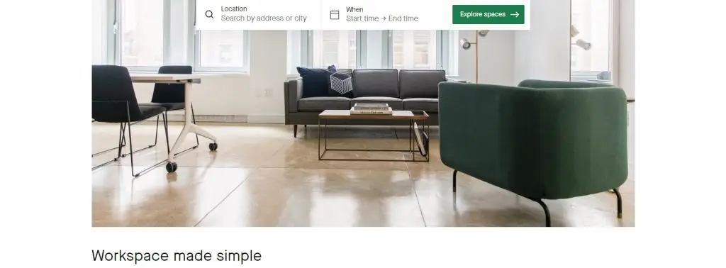
Breather’s landing page greets the visitor first thing with a CTA prompting them to input their location as well as when the visitor plans to make use of Breather’s services.
If, however, the visitor hesitates from interacting with the CTA, they can scroll down to find a few short paragraphs explaining what the company offers as well as step-by-step instructions on how the service works. This goes to show that placing your CTA front and center can improve the experience because potential customers can instantly find what they’re looking for.
Finally, the smooth and soothing colors as well as significant amount of breathing room on the page also serve to add to the experience of the landing page and fall in line with the company’s range of services.
17. Rover
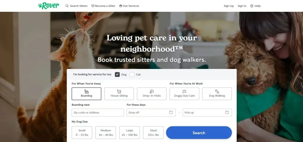
Rover’s landing page, a pet caregiver service, also gets it right on their landing page.
By having pictures of our favorite, four-legged friends at the very top, as well as a form to fill to look for services right away, users will instantly feel like the service has been made to cater for them and their fluffy loved ones.
Moreover, since trusting anyone else with your pets can prove distressing, Rover puts all worries to rest by explaining how their service works; providing testimonials of previous customers; and highlighting several guarantees.
This establishes trust from the outset, making users more likely to convert and sign up for the service.
18. Wise
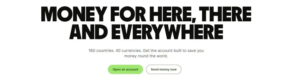
Wise’s landing page gets right into the meat of what their service consists of: its international money transfer service.
You can say that their landing page ticks a lot of boxes when it comes landing page design best practices. In fact, the landing is full to the brim with benefits of using the service, alongside several aspects of what they offer, including their app and their debit card.
There’s also a free currency calculator a few scrolls down that calculates the rate of exchange and the fees you incur when transferring money to a different currency. And, naturally, the most important aspect of financial services, security, is also tackled on Wise’s landing page.
The only thing we would fault this page is that it’s relatively massive with lots of elements and graphics, making it harder to go through than most landing pages.
19. Squarespace
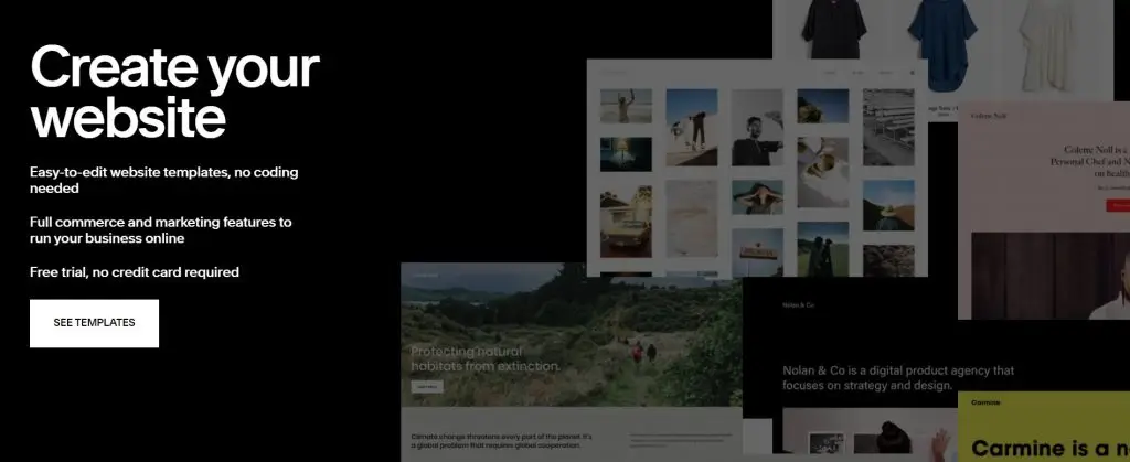
Squarespace’s landing page can be considered as the epitome of “less is more”. In fact, the landing page is no longer than the attached screenshot!
At the same time, it’s probably the darkest of the landing pages we’re looking at, effectively being entirely black and white, save for the colours of the floating webpages. Moreover, rather than asking you to sign up or pay for their service, Squarespace simply tells you to have a look at their templates.
So, in effect, Squarespace’s landing page tells us that sometimes having a short and sweet landing page without much color and much prodding can also be effective.
20. IMPACT
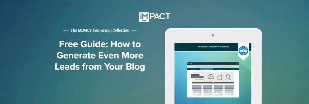
IMPACT’s landing page stands out thanks to its appealing design which sticks to the same range of colors, giving a harmonious design that soothes the eyes.
Moreover, the page doesn’t overdo it with a ton of elements and images: it goes straight to the point with a simple layout that won’t bewilder users with lots of clutter.
However, the biggest takeaway that you should take from this page is the emphasis on the benefit users would receive from IMPACT’s product.
Instead of focusing on the downloading of the ebook, it subtly urges users to download the book by explaining the benefits that one is expected to receive from reading it.
21. Spatium

Spatium’s landing page ditches with text, save for a few sparse paragraphs, and goes straight into what you can expect from its Google Chrome extension.
With varying shades of purple as well as gorgeous, high-resolution images of space, Spatium intends on selling you on downloading its extension by showing you screenshots and features of the product.
The layout is simple and very relaxing, making the experience quite calming. And to top it all off: the extension is absolutely free, which is emphasized in bold on the CTA that greets you when opening the landing page.
22. Snowflake
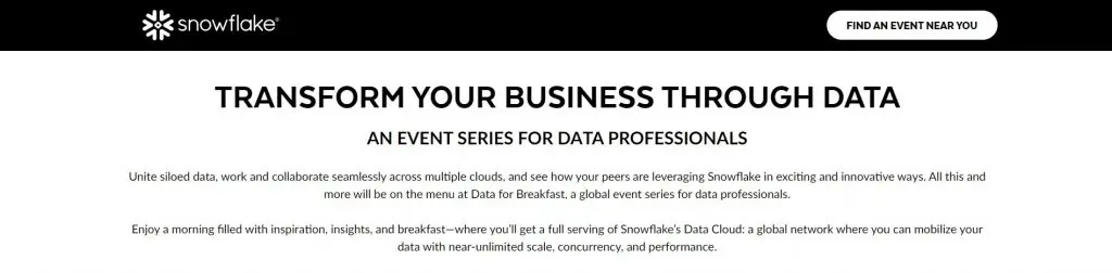
Snowflake, a data cloud company, hits the mark with the audience it aims to attract: data analytics users who don’t require any flashy designs and would prefer having the information they need.
In fact, the landing page is quite minimalistic, barely having any graphics and pictures. Furthermore, the page provides a detailed agenda and interactive event finder to guide potential attendees in choosing events that are best for them.
Finally, Snowflake cleverly uses the tactic of exclusivity: by showcasing sold-out events while also inviting viewers to join a waitlist, they boost the appeal of future event invitations.
23. DoorDash
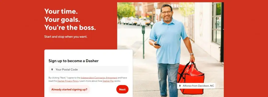
Rather than focusing on attracting new customers, DoorDash’s landing page targets potential delivery drivers, highlighting the benefits of becoming a DoorDash driver (or a Dasher as they call them).
It incentivizes new drivers to join its fleet by underscoring their autonomy and earning potential, particularly catering to individuals looking for flexible work arrangements.
That said, this landing page has some flaws, including the lack of testimonials from currently employed drivers and DoorDash’s failure to highlight any unique advantages over competitors like UberEats.
24. Shopify
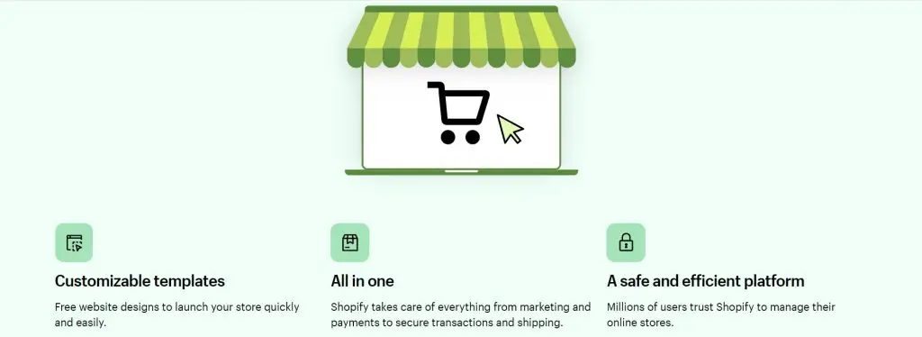
The Shopify sign-up landing page example gets down to business fairly quickly, especially when you consider the rather large sign-up form and the tantalizing offer of both a free trial and 3 months of paying only $1 a month.
Immediately afterwards, it goes into the important selling points of its service and the reasons why it’s such a trust platform. However, in spite of that, a greater emphasis on security as well as more details regarding their benefits would have been preferable.
Other things Shopify’s landing page gets right is the conciseness of its CTA (it only requires an email address after all), the logos of well-known brands that make use of its service, and an FAQ section at the end.
25. Webprofits
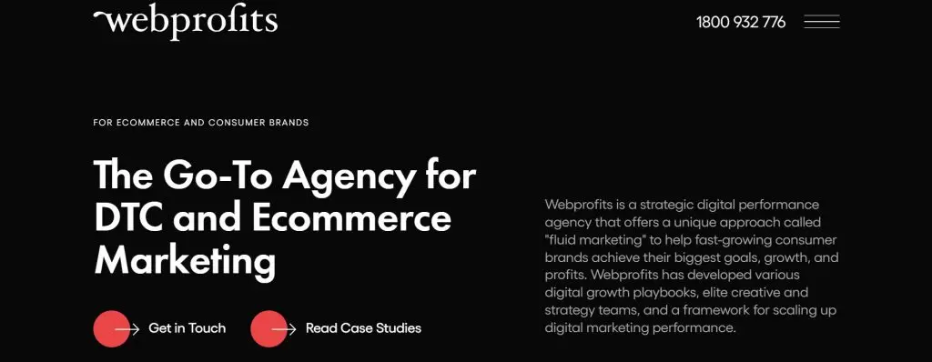
Webprofits’ landing page makes excellent use of a simple colour palette consisting of only black, white, and red. It offers a clean layout with the occasional pops of color, reflecting Webprofits’ prowess in digital marketing and UX design.
Moreover, they go a step further in the section “Who We Help” by employing rollover descriptions that change color and reveal deeper content upon interaction, which can definitely engage attention.
Lastly, the combination of testimonials from reputable companies, the balance of information with graphics and videos, and the subtle but attractive CTAs strategically placed throughout the page make this landing page worthy of inclusion in our list.
26. Codecademy
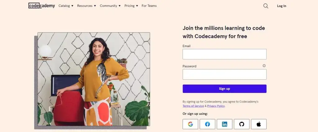
Codecademy’s landing page stands out for its simplicity in both content and design. While the landing page is very visually appealing, it’s not busy with a lot of clutter or excessively colorful elements.
Moreover, the page features a straightforward registration form, hardly requiring any information other than an email address and password. Otherwise, users can instead sign up with their existing LinkedIn, Facebook, GitHub, Apple ID, or Google accounts, which can prove quicker.
Codecademy gets extra bonus points on their page by incorporating social proof elements, such as real-life success stories and testimonials, which is geared towards potential users seeking more information before committing.
All in all, Codecademy’s approach in this landing page aids in making coding, which might seem daunting to beginners, more approachable.
27. Sunbasket
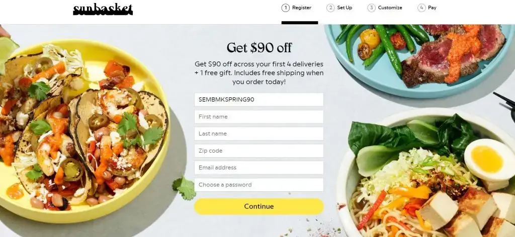
Sunbasket’s landing page starts off with a sign up form that’s rather minimal, requiring only a handful of details, and that already entices users to sign up to the service by offering a free gift & $90 off a user’s first 4 deliveries.
But if that somehow doesn’t convince visitors, Sunbasket’s page is full of drool-worthy images of delicious-looking food. Other than that, the page explains its service by outlining items on its menu, the types of meals it has on offer and meal plans it can cater for.
The numerous CTAs, opportunity for a free gift, as well as a guarantee of its ingredients being fresh are all enticing elements on this landing page. And, to top it all off, it ends with a trio of testimonials as social proof of its services.
28. Wag!
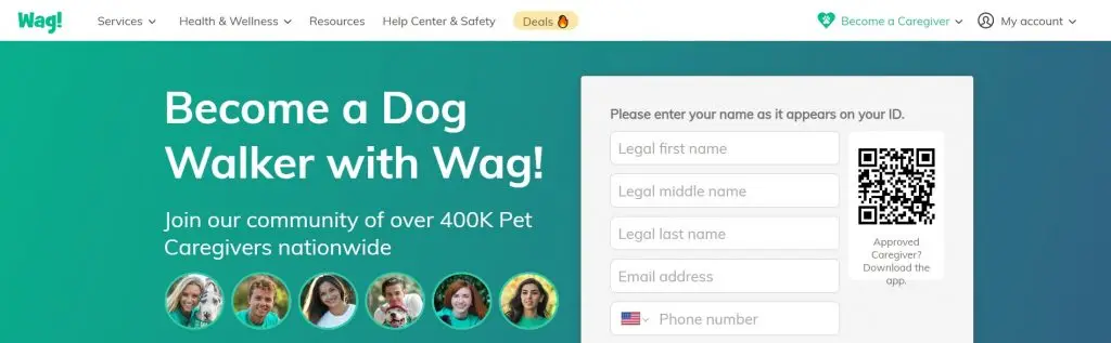
Wag!, which is an app designed to connect dog owners with pet sitter and dog walkers, employs a very straight-to-the-point approach in its landing page by starting straight off with a registration form positioned prominently on the right side against a vivid green backdrop.
Not only that, but the page provides a QR code which makes downloading the app even quicker and easier. Other than that, Wag! uses a substantially large font in order to boost readability and packs its page with inviting prospects to join.
Moreover, Wag!’s credibility is enhanced by displaying images of its caregivers, providing testimonials from caregivers, and highlighting important metrics like its user base, how many US cities it’s available in, and how much it has donated to dog shelters.
However, the benefits and incentives for joining aren’t clearly delineated, which totally misses an opportunity to convey the value of its app.
29. Lyft
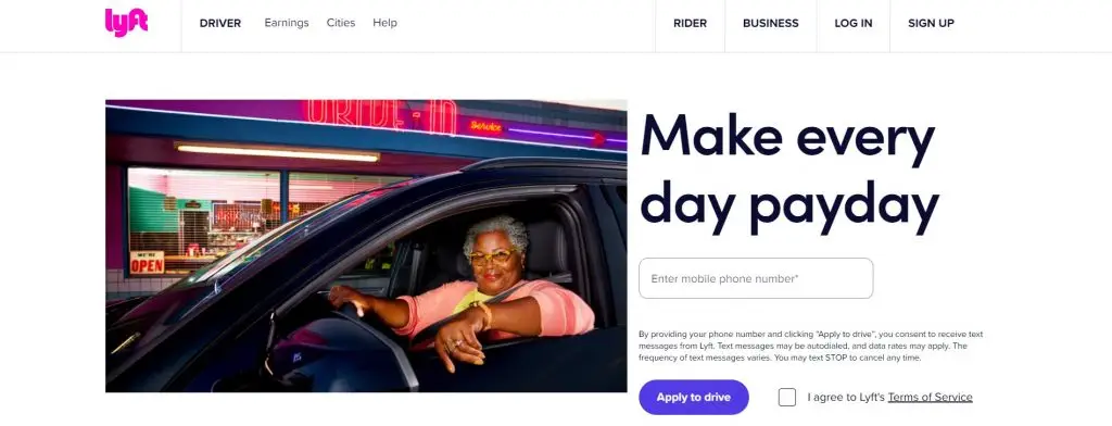
Lyft’s landing page effectively entices new users from the get-go by making use of a captivating headline that will surely attact attention, as well as an image of an actual driver on the job.
The thoughtfully crafted CTA breaks away from the usual tradition: rather than a generic button, the “Apply to drive” button is thematic but it also implies that there is a process behind the application, which not everyone might succeed in. Furthermore, the fact that Lyft only asks for a phone number makes data collection much easier, and it makes sense considering the fact that the service is an app.
Finally, the conciseness of the page combined with links for further reading is perfect for not pushing away users with walls of text but is also great for users who would like to learn more.
30. Curology
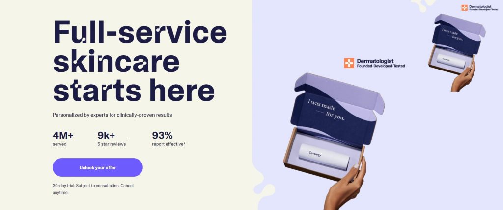
Curology’s landing page gives Squarespace’s page a run for its money by also making use of an extremely brief landing page that’s hardly longer than the above screenshot.
Fitting everything into the top fold, Curology stuff its CTA and concise message into the first screenful, with a pretty visually appealing design.
The brevity of it all goes to show that you don’t need a lot of words to sell something to someone: in fact, Curology’s landing page has only 30 words but it tells you everything you need to know.
31. Zoho
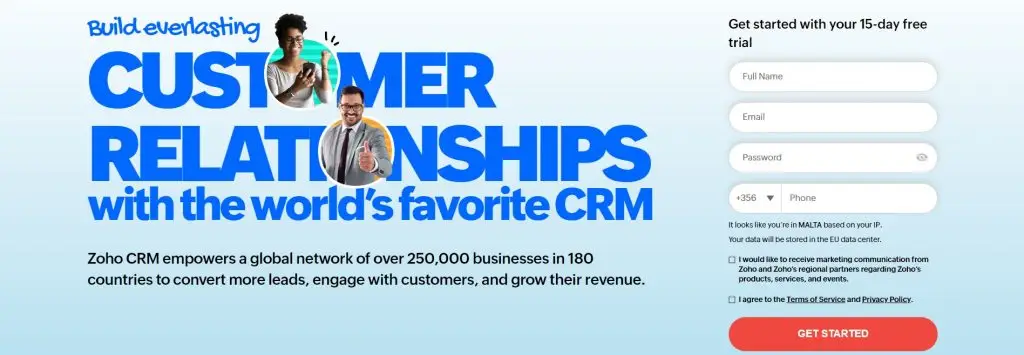
Sometimes, more is actually, well, more, and Zoho’s landing page is a compelling example of this: it features more text than typical landing pages, but it shows that more text isn’t necessarily a bad thing!
Instead, think of it like this: in the end, it equips users with ample information to make informed decisions. In an insanely competitive industry like CRM, this is especially valuable.
However, don’t just stuff your landing page with text. Zoho’s landing page is chock-full with different elements, like client logos, awards, statistics, and graphics, that also make it visually appealing other than compelling.
And to finish off with the most important takeaway from this landing page: if you want to set yourself apart from the competition, don’t just fill your copy with fluff saying you’re better than the rest. Instead show it with comparison tables, features of your product, and unique selling points whenever possible.
32. Nauto

Nauto, a platform for self-driving cars, uses a simple, and straightforward landing page that can be explored with only one scroll to promote its ebook.
The simplicity of Nauto’s landing page aligns with their focus on safe autonomous driving since it steers (pun intended) clear from a very distracting page. Moreover, the clean design of the page, the prominent “Download Now” heading, the form that’s visible above the fold are all conducive to the goal of getting users to download the ebook.
Finally, the page avoids being overly technical, instead offering valuable statistics and ways of how the ebook can improve lives, making the offering even more tempting.
33. LinkedIn Ads
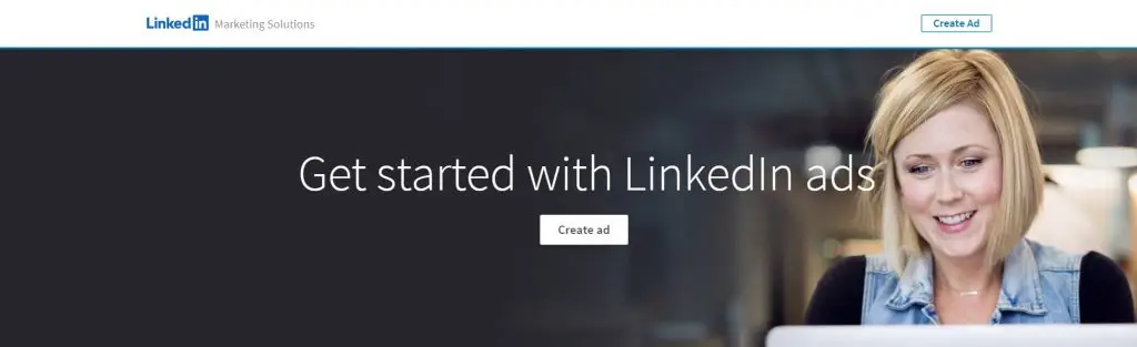
LinkedIn Ads’ landing page is short, sweet, and goes straight into the meat of its existence: the advantages of advertising on LinkedIn for businesses.
In fact, the page provides a handful of statistics as well as its benefits arranged in a carousel, which means that space is conserved and the page is rendered interactive at the same time.
On top of that, users can find a short, three-step process to getting started on LinkedIn Ads. So, not only will you leverage the power of LinkedIn for your ads, the process of creating an ad campaign is also dead simple.
While the page has a couple of CTAs, the most important one is the one placed in the persistent header menu, that remains at the top as you scroll down.
34. Startup Institute
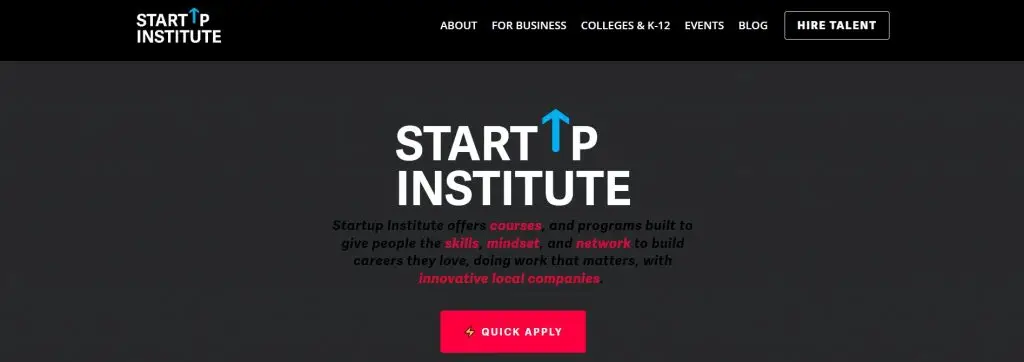
Startup Institute’s landing page is another entry in the “more is more” type of landing pages.
By setting clear expectations of what visitors can receive from signing up by providing plenty of information about their courses as well as providing links for further reading and a Q&A section alongside the sign-up form, users benefit from plenty of transparency which helps them align their expectations and quell any of their doubts.
By focusing on providing as much information as needed to help users make a decision on signing, Startup Institute’s strategy helps to build trust and increase the likelihood of conversion.
35. Spotify
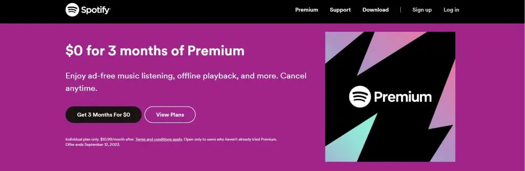
Everybody and their mother will probably recognize Spotify’s iconic green. However, their unique landing page design with black and shades of purple, stands out from its usual branding to signal a distinct purpose.
The simplicity and color palette of this landing page put the text and CTAs into sharp focus, meaning that their offerings and benefits instantly become more attractive thanks to their prominence.
In other words: if you have an iconic brand, don’t be afraid to break away from your usual branding if there is a good reason for doing so. Moreover, an original page design can be a gamechanger in terms of conversion boosts.
36. Wix
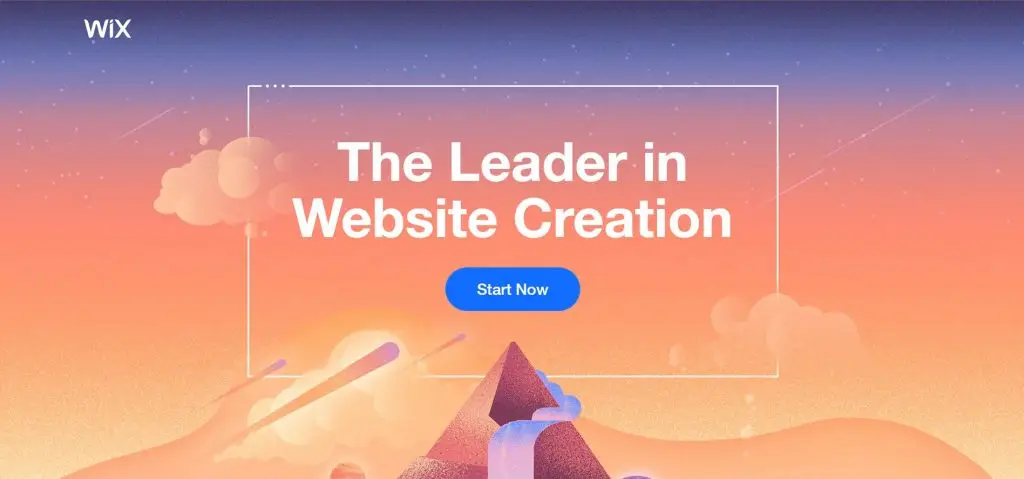
Wix’s landing page gets you to scroll down the page to experience the beautiful design of their landing page, that has brief bits of text interspersed.
The landing page has plenty of breathing room for both the design and the isolated bits of text, so the elements don’t feel stifling to the visitor, but instead it translates into a serene experience and go down the page.
The beauty of the page, as well as the strategically placed CTAs and the clever combination of the design and the CTA (for example, the peak of the pyramid poining at the main CTA), makes this landing page an excellent example to follow.
What Makes a Good Landing Page?
The measure of great landing pages depends largely on your specific goals, audience, and industry. However, no matter which industry you operate in or what services you’d like to offer, there are nonetheless certain best landing page attributes that overlap.
So, in our humble opinion, the best landing page layout should include:
Clear and Compelling Headline
Your headline is the first thing visitors will see and so it should immediately tell them what the value of your products or services are.
If you don’t capture visitors’ attention right there and then, you risk losing potential customers. In fact, according to a 2006 study published in Behaviour & Information Technology, you have only 50 milliseconds to impress users.
That’s not a lot, which is why first impressions really count.
Engaging Visuals
The well-known adage “you eat with your eyes first” might be referring to food but trust us when we say that it refers to pretty much everything else in life.
Another surefire way to attract attention is to use high-quality images and videos that are relevant to your offer. This is naturally because it adds to the visual appeal of your page while also helping to put out your message more effectively.
And there are statistics (graciously provided by MarketSplash) that back this up too:
- An astounding 64% of consumers decided to buy a product after watching a branded piece of video content, while 54% of consumers expressed an interest in seeing more video content from the brands they support.
- 43% of consumers of all ages, and 47% of GenZ consumers, have said that photo or video content makes them more likely to engage with a brand.
- Finally, the importance of visuals seems to be on the increase since 56% of consumers say they’re more influenced by social media images and videos now than they were before the pandemic.
Concise Copy
It’s always been the nature of the internet to simply scan content. In fact, a study done in 1997 by the Nielson Norman Group found that only 16% of users actually read word-for-word, and a recent study by Contentsquare found that time-on-page and scroll rate are dropping globally.
Don’t push your visitors away with florid text and interminable sentences. Instead, pour all of your efforts into providing a great landing page copy that is clear, concise, easy to scan, and that focuses on the benefits of your services.
Strong Call-to-Action (CTA)
Never forget the power of the CTA when designing your landing page. All of the best landing pages have them, and it’s easy to see why.
Battling for readers’ attentions is the name of the game in advertising and having an eye-catching and stunning CTA is perfect for both catching a visitor’s attention as well as directing them to where you want them to go.
Minimal Navigation
As we said in the beginning of this page, a landing page is optimised to take visitors to where you want them to go.
To do this, you have to make your landing pages as clutter-free as possible, including removing unnecessary navigation links or any other distractions that could lead visitors away from your intended conversion goal.
After all, your landing page is to get users to convert and not to explore the rest of your website, and so the best converting landing pages are the ones that have been stripped of all distractions.
What Is a Good Landing Page Conversion Rate?
Ah, yes, the million-dollar question: what is the landing page conversion rate you should be aiming for?
Unsurprisingly, the answer is the rather bland truth: it depends. As the best landing pages for conversions will differ according to the niche you inhabit, so will the conversion rates that you can experience.
WordStream found that across the industries they studied, the average conversion rate is 2.35%. However, the top 25% of companies are seeing conversion rates of 5.31% and over, while the top 10% regularly experience conversion rates of 11.45% and higher!
On the other hand, Unbounce’s study discovered a variety of conversion rates, with the average for different industries raning from 8.8% all the way to 18.2%.
So, while conversion rates differ across different markets, if you aim for a conversion rate that’s around 2-6%, you should be performing excellently.
Landing Page Best Practices
If you’re interested in how to create the best landing page, we are finishing off our page with a list of the best practices for landing pages.
This is because it’s important to remember that the best landing page design will likely vary based on what you intend to achieve, your intended audience, and the industry you’re in.
Other than following basic optimisation tricks like inserting your main keyword in your headline, our recommended best landing page practices include:
- Tracking and Analytics: it’s absolutely imperative to regularly analyze your landing page’s performance in order to make data-driven adjustments that will help you optimize its effectiveness over time. To do this, you need to set up tracking tools to monitor how your landing page is performing; track your conversions; and from there, gather insights in order to further optimize your landing page.
- A/B Testing: related to the previous point, monitoring the performance of your pages leads to optimizing your landing pages, and optimizing your landing pages necessitates A/B testing. After all, what you think might drive conversion rates, might actually push users away. Continuously test different elements of your landing page to identify what resonates best with your audience and thus improve conversion rates.
- Social Proof: trust is extremely important for a business. In fact, research suggests that 31% of consumers consider trustworthiness as as a brand’s most important aspect. While trust is obviously hard to build, including testimonials, reviews, or trust badges can help to build trust with your audience by establishing credibility.
- Privacy and Security: speaking of trust, how can visitors learn to trust you if you don’t reassure them? In other words, if you’re going to collect personal information, do yourself a favour and reassure visitors about the security of their data. And don’t forget to include a link to your privacy policy!
- Benefits-Focused Content: over the course of our list of great landing page examples, one thing came out to the fore: the need to highlight the benefits and value of your offer. In order to capture visitors’ attention FAST you need to explain how your product or service solve’s your audience’s problem.
- Mobile Responsiveness: the world is changing at a rapid pace, and whereas 20 years ago smartphones were a bit of a rarity, nowadays around three quarters of the world’s population uses one (and it’s set to increase by 2028). Moreover, it was predicted in 2019 that around 3.7 billion people will ditch their computers and use solely smartphones to access the internet by 2025. The bottom line? Mobile-optimized landing pages are imperative if you want to succeed.
- Minimal Form Fields: we have said it before, and we’ll say it once again: users’ attentions spans are getting shorter and shorter, and you can almost guarantee pushing a user away if you ask them for too much information. If you’re collecting information through a form, keep it as short as possible.
- Loading Speed: in a world of dwindling attention spans and increasing mobile usage, loading speeds are pivotal. In fact, Google’s own research shows that a difference of 2 seconds in loading time increases bounce rate by 32%. If you want to capture attentions fast, you have to be fast yourself.
- Urgency and Scarcity: a classic marketing trick is to create a sense of urgency or scarcity for users in your CTAs. In fact, research suggests that creating a sense of urgency leads to higher conversions, and a sense of scarcity adds to the value of your product.
- Relevant and Targeted Content: as you would find it weird if someone veers off-topic mid-conversation, visitors would find it doubly weird if they up on a landing page that has nothing to do with where they were before. Make sure that your landing page matches what drove visitors to your page in the first place. Finally, don’t forget to be consistent throughout your landing page both in messaging and design.
FAQs
{ “@context”: “https://schema.org”, “@type”: “FAQPage”, “mainEntity”: [{ “@type”: “Question”, “name”: “What are landing pages used for?”, “acceptedAnswer”: { “@type”: “Answer”, “text”: “Landing pages serve as focused destinations where visitors are directed from ads or campaigns. They’re designed to prompt visitors to do specific actions, like signing up to a service, downloading software or an ebook, or buying a product. These pages streamline user experience, leading to higher conversion rates compared to regular website pages.” } },{ “@type”: “Question”, “name”: “What is the difference between a website and a landing page?”, “acceptedAnswer”: { “@type”: “Answer”, “text”: “Websites are comprehensive online spaces containing various pages for information, while landing pages are single-purpose, guiding visitors to take a particular action. Unlike websites, landing pages minimize distractions and focus solely on conversion goals.” } },{ “@type”: “Question”, “name”: “Are landing pages effective?”, “acceptedAnswer”: { “@type”: “Answer”, “text”: “Absolutely. Research carried out by HubSpot indicates that businesses with more landing pages tend to experience significant conversion rate improvements. For instance, having 10-15 landing pages can result in a 55% increase in conversions, while exceeding 40 landing pages can boost conversions by over 500%.” } },{ “@type”: “Question”, “name”: “Should landing pages be indexed?”, “acceptedAnswer”: { “@type”: “Answer”, “text”: “As a landing page best practice, it’s generally best to prevent landing pages from being indexed. In fact, indexing landing pages could dilute their focused purpose, potentially affecting their effectiveness in driving conversions. So, making use of noindex tags or applying canonical links can help maintain landing page intent while preserving SEO efforts.” } },{ “@type”: “Question”, “name”: “Can a landing page be a homepage?”, “acceptedAnswer”: { “@type”: “Answer”, “text”: “Yes, but it’s not particularly ideal. As we have said before, landing pages are crafted to direct users to do specific actions, while homepages are used for broader navigation of the website itself. Directing ad traffic to a dedicated landing page often yields higher conversion rates as visitors encounter a tailored experience aligned with their intentions.” } },{ “@type”: “Question”, “name”: “Do landing pages rank on Google?”, “acceptedAnswer”: { “@type”: “Answer”, “text”: “Landing pages can rank on Google if they’re optimized for relevant keywords and have quality content. However, their primary focus is on conversions rather than extensive content. Besides, it’s not a good idea to have your landing pages indexed as their purpose is to optimize conversions and not rank for keywords like usual SEO pages.” } },{ “@type”: “Question”, “name”: “Should landing pages have navigation?”, “acceptedAnswer”: { “@type”: “Answer”, “text”: “Minimizing navigation on landing pages is a good idea. On-page distractions can divert visitors from the action you’d like from them. By removing or limiting navigation links, you keep the focus on the conversion goal, resulting in higher chances of successful outcomes.” } },{ “@type”: “Question”, “name”: “Are landing pages free?”, “acceptedAnswer”: { “@type”: “Answer”, “text”: “Landing pages are typically created using specialized tools or platforms, some of which require you to pay up. While some platforms offer free options, advanced features and customization will often ask for payment. However, all things considered, investing in well-designed landing pages often outweighs the costs because a better looking landing page brings improved conversion rates and ROI.” } }] }What are landing pages used for?
Landing pages serve as focused destinations where visitors are directed from ads or campaigns. They’re designed to prompt visitors to do specific actions, like signing up to a service, downloading software or an ebook, or buying a product. These pages streamline user experience, leading to higher conversion rates compared to regular website pages.
What is the difference between a website and a landing page?
Websites are comprehensive online spaces containing various pages for information, while landing pages are single-purpose, guiding visitors to take a particular action. Unlike websites, landing pages minimize distractions and focus solely on conversion goals.
Are landing pages effective?
Absolutely. Research carried out by HubSpot indicates that businesses with more landing pages tend to experience significant conversion rate improvements. For instance, having 10-15 landing pages can result in a 55% increase in conversions, while exceeding 40 landing pages can boost conversions by over 500%.
Should landing pages be indexed?
As a landing page best practice, it’s generally best to prevent landing pages from being indexed. In fact, indexing landing pages could dilute their focused purpose, potentially affecting their effectiveness in driving conversions. So, making use of noindex tags or applying canonical links can help maintain landing page intent while preserving SEO efforts.
Can a landing page be a homepage?
Yes, but it’s not particularly ideal. As we have said before, landing pages are crafted to direct users to do specific actions, while homepages are used for broader navigation of the website itself. Directing ad traffic to a dedicated landing page often yields higher conversion rates as visitors encounter a tailored experience aligned with their intentions.
Do landing pages rank on Google?
Landing pages can rank on Google if they’re optimized for relevant keywords and have quality content. However, their primary focus is on conversions rather than extensive content. Besides, it’s not a good idea to have your landing pages indexed as their purpose is to optimize conversions and not rank for keywords like usual SEO pages.
Should landing pages have navigation?
Minimizing navigation on landing pages is a good idea. On-page distractions can divert visitors from the action you’d like from them. By removing or limiting navigation links, you keep the focus on the conversion goal, resulting in higher chances of successful outcomes.
Are landing pages free?
Landing pages are typically created using specialized tools or platforms, some of which require you to pay up. While some platforms offer free options, advanced features and customization will often ask for payment. However, all things considered, investing in well-designed landing pages often outweighs the costs because a better looking landing page brings improved conversion rates and ROI.